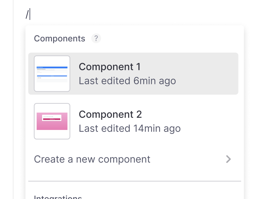
Components are reusable building blocks for your app. They help you create consistent, maintainable interfaces by breaking down complex UIs into smaller pieces.
Break down large projects - Split large projects into manageable pieces
Maintain consistency - Once perfected, components work the same way everywhere
Save time - Reuse components instead of regenerating similar elements
Improve accuracy - Shorter, focused prompts help Create generate more precise code
Share with team - Build a library of components for your organization
As pages grow longer in terms of lines of code, AI models become more likely to make errors. Breaking your project into components helps save lines of code, and improve accuracy.
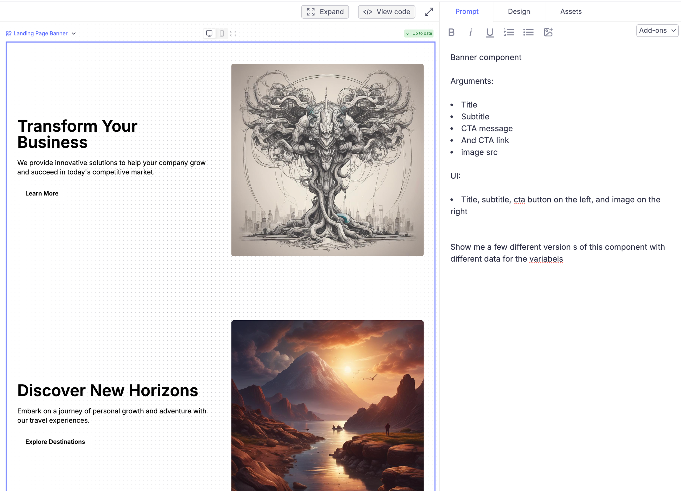
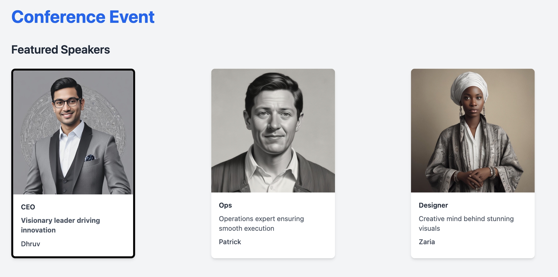
Components can accept arguments to customize their appearance or behavior. For example:
Button text and colors
Card content and images
Form field labels and validation
Section headings and descriptions
To add arguments, describe what you want the component to accept.Example prompt: “Create a banner component that accepts:
Title
Subtitle
CTA text
Background image
Theme (light/dark)”
You’ll want to explain how to use these arguments.Later, when using the component, Create will guess the right values to pass in for the component’s arguments from its context, or you can be explicit on what you want.
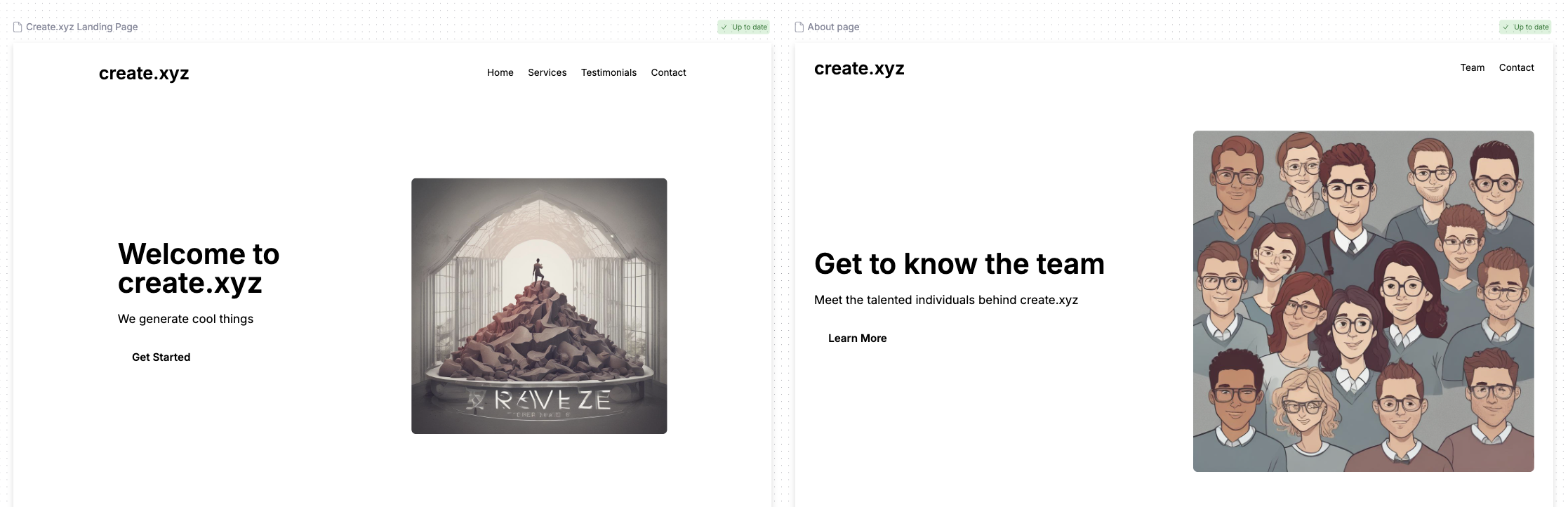
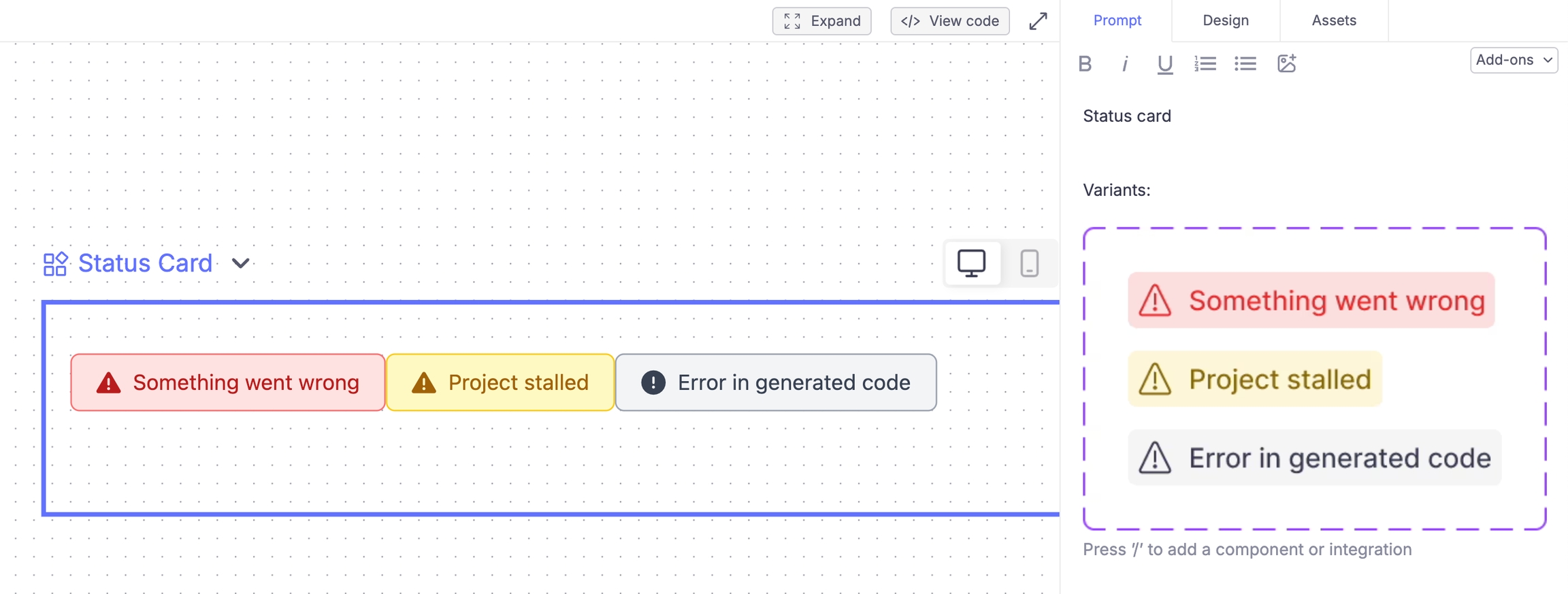
Preview stories help you test how your component works with different inputs. They show examples of your component in action, letting you check that it works correctly in various scenarios. Create automatically generates these previews to help you validate your component’s design and functionality.
Different text lengths and content
Various image sizes
Multiple color themes
Custom argument combinations
The preview wraps your component in a container that lets you:
Change the preview width
Test responsive layouts
See how it looks embedded in other components
Verify spacing and alignment
Control previews by describing what you want to test:Example prompt: “Show preview stories with:
Short vs long text content
Light and dark themes
Different container widths (mobile to desktop)
Various image aspect ratios”
While you’ll see all preview stories on the component’s canvas, when you use the component in your app, you’ll only see the specific instance you create. The preview stories help you test and validate your component but don’t affect how it works in your final app.